“Undesign” Your Portfolio Website
Apr 2 2012 by Kean Richmond | 17 Comments | Stumble Bookmark
Even the most ineffective, unattractive or simple of man-made objects have been designed in some way. The same is true for the Web: Even the most hideous of websites are created by someone who has consciously made decisions into its design.
For web design professionals, it’s normal to put a lot of work into a design, using research, analysis and their expertise to form a design to delight and engage. This process is not quick and while many of us spend hours crafting websites for clients, our own website goes wanting.
It’s in this situation that the process of undesign is growing.
Undesign 101
I associate “undesign” with websites where the design and content is scaled back to the bare necessities, allowing for the quick implementation of a simple yet professional design.
So far, only a small group of designers have adopted such an approach, so how undesign is defined in the future will inevitably change as more of us experiment with it.
Looking at an undesigned website, it may appear to be an application of minimalism to its extreme.
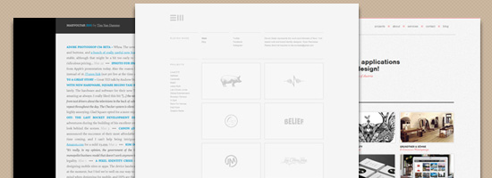
Eleven Made, portfolio of NYC-based web and brand identity designer Ryan Paonessa.
Though an undesigned website can be identified by what you can (or can’t) see, it’s also about the process and the choices made by the designer that defines it.
Why Undesign?
Let’s discuss some of the pros of creating an undesigned site.
Easier to Create and Change
Designers typically redesign their website for one of two reasons. Firstly, their site no longer fulfills the objectives they wish it to. Secondly, they wish to change the design because they’ve grown bored of it.
No matter the reason, many full-time designers find it difficult to devote much time to changing the design of their website. To create a design and then deploy it is no quick task and, with so much else going on, it can be hard to find the time to speedily make the redesign happen.
By scaling back the complexity of the design, and the scale of the website as a whole, a once lengthy process can become much shorter, with the workload greatly reduced.
Easier to Make Responsive
Responsive design is still in its early days. This has, to a certain extent, made undesign a more desirable option as the rich interfaces we once created are even more complex to achieve when trying to make a responsive website.
Mark Boulton’s website has a responsive layout.
With responsive design seen as a must for any designer’s new website, the time that can be devoted to the design itself is further reduced and thus the design is more undesigned than it may have been without the addition of making it responsive.
When You Don’t Need to Show Off
For some designers, their work and reputation are so well known within the community that they don’t need an elaborate web design to impress potential clients.
Max Voltar is the site of well-known designer Tim Van Damme.
Some other reasons for going the undesign route are:
- You’re a full-time designer: A designer that works full-time for an agency may only need a site as a repository for thoughts and their personal work.
- You have a high volume of clients: A designer can be booked up with so much work that they are no longer actively looking to be hired by more clients. So their site, like a full-time designer, is not essential in gaining work.
- You have a strong portfolio: A designer may feel their portfolio is strong enough to speak for itself without the need to utilize their own site as an extension of their portfolio.
Undesign May Not Be Your Client’s Cup of Tea
The way you design your website can be viewed as an extension of your work portfolio, a way to show off your personality and skills. The design flourishes we add to our sites are the products which sit in the window showing, the type of designer we have become and the level of our skills.
So why would you employ a stripped back design in your portfolio site if you want to display your design capabilities? A professional is able to recognize a well-crafted, well-thought-out minimal design against something that’s just hastily put together. But for most clients, the distinction isn’t always obvious.
Instead, a client viewing an undesigned website might see a website that may appear to contain no show of exceptional skill and a website that lacks personality and any element of uniqueness.
As a design style, undesign is not like the rest. Undesign will, at least for the time being, may only ever find a home on the website of a web professional. The reason undesign might not be suitable for client work is that it’s difficult to find a client open-minded enough to consider such a stripped-down design approach.
Undesign could find its way on personal websites, but non-designers are more likely to be attracted to more complex designs.
Examples of Undesigned Websites
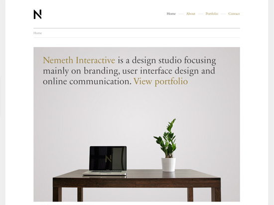
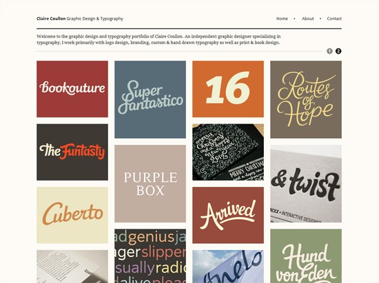
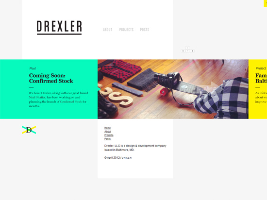
For inspiration, here are some more examples of undesigned portfolio sites.
Stuff & Nonsense (Andy Clarke)
Just Another Trend?
The idea of undesign seems to be so new to the community that it could just become yet another trend that disappears in a year or two. The fact that high-profile designers like Elliot Jay Stocks, Mark Boulton and Tim Van Damme have adopted such an approach for their own sites will most certainly lead to others considering the same approach for their website.
A trend in web design is something that many designers grow quickly excited about but, by over-adoption or on questioning the reasons behind its use, soon falls out of favor. Think of the glossy “Web 2.0” look or faux coffee rings that came and went. The reasons behind using these styles and effects in our designs, in many circumstances, were weak at best.
Though time will inevitably dictate whether undesign sticks around for the long haul, I don’t think it can ever be considered as just a trend as I believe that it will always be a style that designers can adopt in situations where time is at a premium.
Related Content
- Five Popular Design Portfolio Website Styles
- 4 Steps to Building a Portfolio Website Using Drupal
- Design a Minimal and Modern Portfolio Layout with Photoshop
- Related categories: Web Design and Project Management
About the Author
Kean Richmond is a full-time web designer and developer based in Yorkshire, UK. Working as a generalist in most areas of web design and development he currently works at Bronco, tweets as @keanrichmond and rants on his personal blog.
17 Comments

Tayo
I agree. Personally I refer to such designs as “classic” or “timeless” because they are not necessarily trendy, but are able to effectively accomplish what they are built for, while still retaining a certain aesthetic quality.

Madan Patil
Nice trend/concept bring in light.
I think “Undesign” is the one of the other form of minimalistic designs. If you are a designer you can understand how hard to be simple. Actually simple designs needs more of thinking.
Thank you for this article.
Helen
In the recent past I’ve not been a fan of this style, but I do like Clair Cullen and Stuff & Nonsense in the examples above.

Daniel
Undesign? Everything you’ve mentioned above is minimalism. Why coin a new term for it? It’s a potentially harmful misnomer – how are clients going to value something you’ve have labelled as lacking the one task you’re actually performing?

What?
“Undesigned”?
This is just dimwitted, backwards bullshit in an attempt to put a label on something, and quite contrary to what your claim that “only a small group of designers have adopted.”, virtually every independent designer out there puts this into practice. The good ones at least.It’s logical, practical minimalism. Nothing more, nothing less.
Get it right.Look at every folio host or CMS out there. Cargo Collective, Indexhibit, Behance.
Minimalism.
Not “undesigned”.

Kerrick Long
I “undesigned” my photography portfolio website from the beginning. It really makes the photos stand on their own and speak for themselves, to use a couple clichés.

Paul Murray
I’m a fan of simple, clean layouts when it comes to portfolios. I try and strip my own back as much as I can to put the emphasis on my content.
I think there needs to be a little give though, especially if you want an engaging blog too, as a site that’s too minimal can come across as a little ‘cold’ and could turn visitors away.

PXLated
I’m not sure any of your examples are “undesigned”. They may be minimal, clean, and efficient in style but all have been “designed”. Am also not sure it saved anyone time. They probably labored over the look/feel/strategy just as much as if the sites had been styled a little more complexly.
Simplicity != Simple
Michiel
Good article, only the notion of Undesign I dont really get it. I mean, every one of your examples has been designed with great eye for detail. You give the impression that it’s easy to do make a minimal design.
Keep it up!

Navigator Multimedia
Nice article. I see from your examples that the principles of undesign differ from minimalism, and that the two should be distinguished. However, like minimalism, it seems that undesign cannot be scoffed at as a trend, but as you said, ” a style that designers can adopt in situations where time is at a premium,” or when the design process becomes overwhelmed by content and needless elements. It creates an exercise in mindful design for user experience.
Thanks again,
Sarah Bauer
Navigator Multimedia
ls
You can’t possibly think it takes less time to design any of these sites. It’s called good design, not undesign.

Kevin Soon
To many visually heavy designers, this article would seem a bit poignant – but I couldn’t agree more with the concept of “undesigning”. I’ve tackled this debate numerous times while re-designing my own portfolio, only to come to the conclusion that less is certainly more. No texture, no patterns, no intensive backgrounds, just straight content and focus – give the work some weight. While I still see very impressive sites that are far from lacking detail, I suppose designers can go a number of ways: 1) Make it heavy to represent myself, 2) Make it light to emphasize my work, 3) Do both.
Then again, perhaps it’s all an exercise of simplification that tends to come at the price of holding back on the extra design goodies 🙂 Great article!
Leave a Comment
Great examples of minimalist website designs. Not sure about the ‘undesign’ term, it still takes a lot of work to design a minimalist site, in fact more sometimes.







Heya just wanted to give you a brief heads up and let you know a few of the
pictures aren’t loading correctly. I’m not sure why but I
think its a linking issue. I’ve tried it in two different browsers and both show the same results.
Thank you, will have a look into it!